Home Values: DEFINITELY NOT in Bubble Range

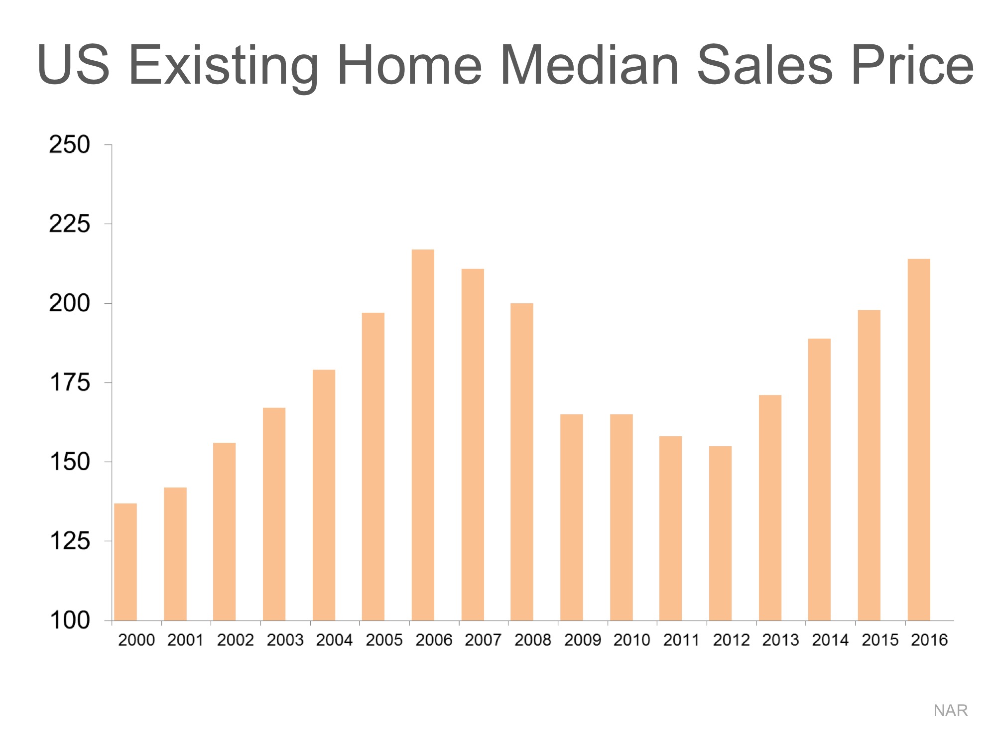
There are some industry pundits claiming that residential home values have risen too quickly and that current levels are on the verge of another housing bubble. It is easy to see how this thinking has taken form if we look at a graph of home prices from 2000 to today.

Home Values: DEFINITELY NOT in Bubble Range!! | Simplifying The Market

The graph definitely looks like a rollercoaster ride. And, as prices begin to reach 2006 levels again, it “seems logical” that the next part of the ride would be downhill. However, this graph includes the anomaly of the price bubble and the correction (the housing crash).

What if the bubble & bust didn’t occur?

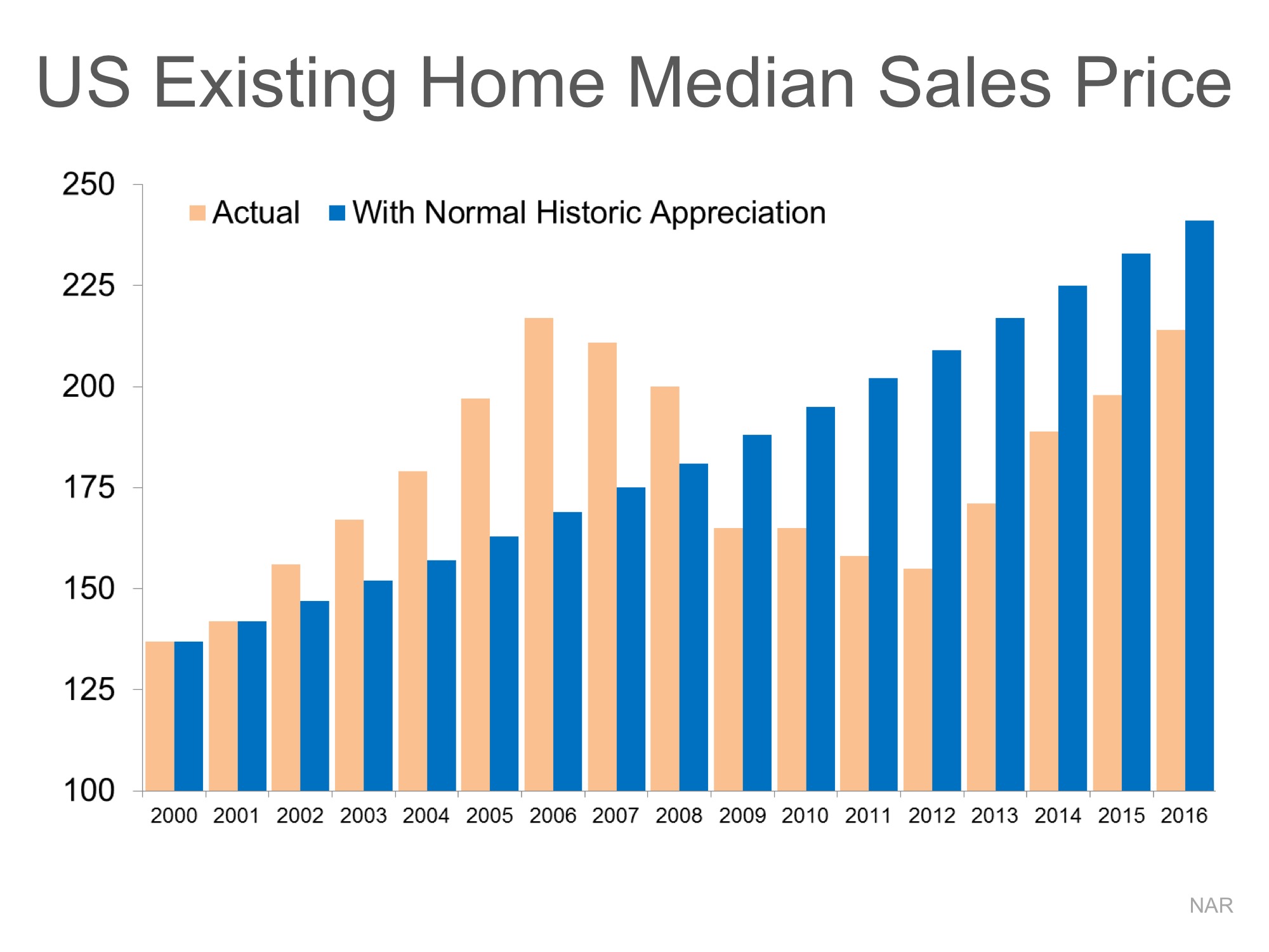
Let’s assume that instead of the rise and fall in home prices that we saw last decade, we just had normal historic appreciation from 2000 to today. According to the 100+ experts that are surveyed for the Home Price Expectation Survey, normal annual appreciation for residential single family homes from 1987 to 1999 was 3.6%.

Starting with the median home price in 2000, we added 3.6% to it each year since then. Here is that graph intermixed with the above graph.
Home Values: DEFINITELY NOT in Bubble Range!! | Simplifying The Market
What this shows us is that, had the bubble and crash not occurred and instead we just had normal annual appreciation over this period, prices would actually be greater than they are today.

Bottom Line

There is no reason for alarm as prices seem to be right in line with where they should be.

4 Stats That PROVE This Is NOT 2005 All over Again

Recent research by the National Association of Realtors (NAR) examined certain red flags that caused the housing crisis in 2005, and then compared them to today’s real estate market. Today, we want to concentrate on four of those red flags.

  1. Price to Rent Ratio
  2. Price to Income Ratio
  3. Mortgage Transactions
  4. House Flipping

All four categories were outside historical norms in 2005. Home prices were way above normal ratios when compared to both rents and incomes at the time.

NAR explained that mortgage transactions as a percentage of all home sales were also at a higher percentage:

“Loose credit was one of the main culprits of the housing crisis. Mortgage lending expanded dramatically as unhealthy housing speculation reached its peak and was met by the highest level of credit availability as measured by the Mortgage Bankers Association. The index measures the overall mortgage credit condition by the share of home sales financed by mortgages. This metric does not capture credit quality, but it does set a view of the importance of financing in supporting the housing market.”

House flipping was rampant in 2005. As NAR’s research points out:

“Heightened flipping activity is a clear indication of speculation in the real estate market. A property is considered as a speculative flip if the property is sold twice within 12 months and with positive profit. Flipping is a normal part of a healthy housing market. In an inflated housing market, expectations about short-term profit from pure price appreciation are very high; therefore, the level of flipping activity would show evidence of being heightened.”

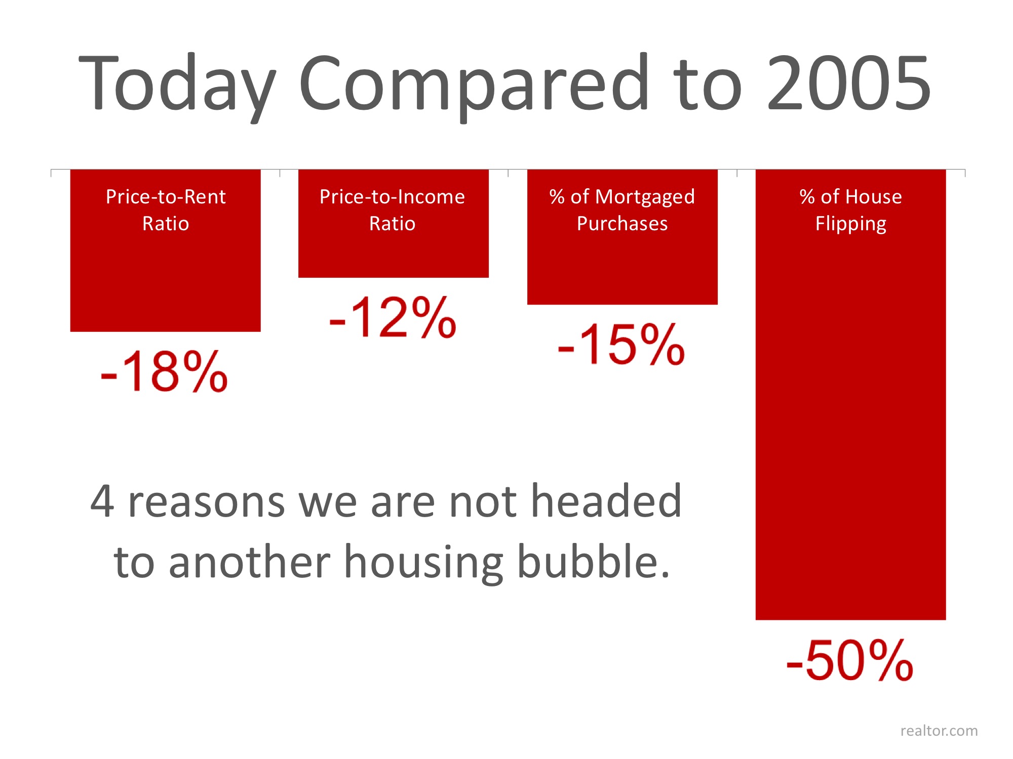
Here are the categories with percentages reflecting the unrealistic ratios & numbers of 2005 as compared to the current market. Remember, a negative percentage reflects a positive gain for the market.

4 Stats That PROVE This Is NOT 2005 All over Again | Simplifying The Market

Bottom Line

They say hindsight is 20/20… Today, experts are keeping a close watch on the potential red flags that went unnoticed in 2005.